

Faithful Presence Conference Landing Page
For Faithful Presence, the landing page had to feel calm, grounded, and easy to follow. Deacon Solutions helped shape a page experience that introduced the event, organized key details, and made the registration path easy to find.
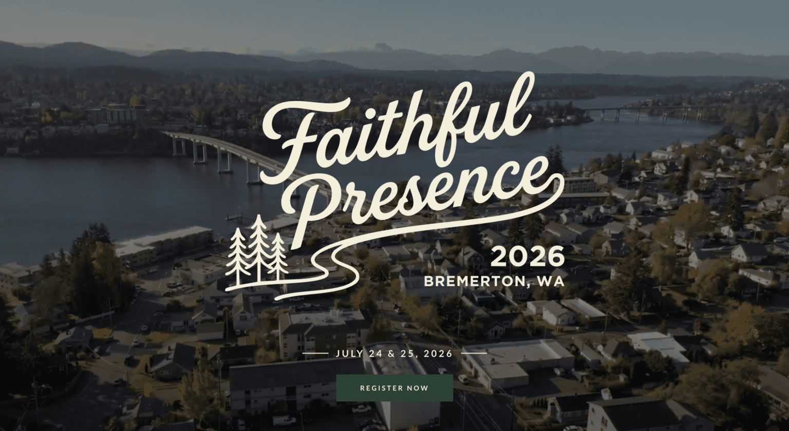
The communication need.
A name like Faithful Presence carries meaning, but the page still had to help visitors understand the conference quickly. The design needed to feel warm and steady, while also making the event date, location, speakers, schedule, and registration path easy to find.
Deacon Solutions approached the project as both an event communication and landing page challenge: create a first impression that felt trustworthy, then make the next step easy to see.
What Deacon Solutions handled.
The work stayed focused on giving Faithful Presence a conference landing page that could carry the event message, details, and registration path without feeling crowded.
Event page direction
Created a landing page flow that introduced the conference and gave visitors a clear path to register.
Event details and schedule
Organized details like date, location, speakers, schedule, FAQs, and registration into a clear page structure.
Visual consistency
Used the conference graphics and visual system consistently so the page felt cohesive from hero to footer.
A clearer event destination
Faithful Presence had one focused page where visitors could understand the conference and find the next step.
A calmer page experience
The page avoided unnecessary clutter while still carrying event details, speakers, schedule, and FAQs.
A clearer next step
Visitors could understand the event and move toward registration without sorting through too much information.
Landing page graphics.
The Faithful Presence page used a small set of consistent event graphics to make the conference feel established while keeping the registration path clear.
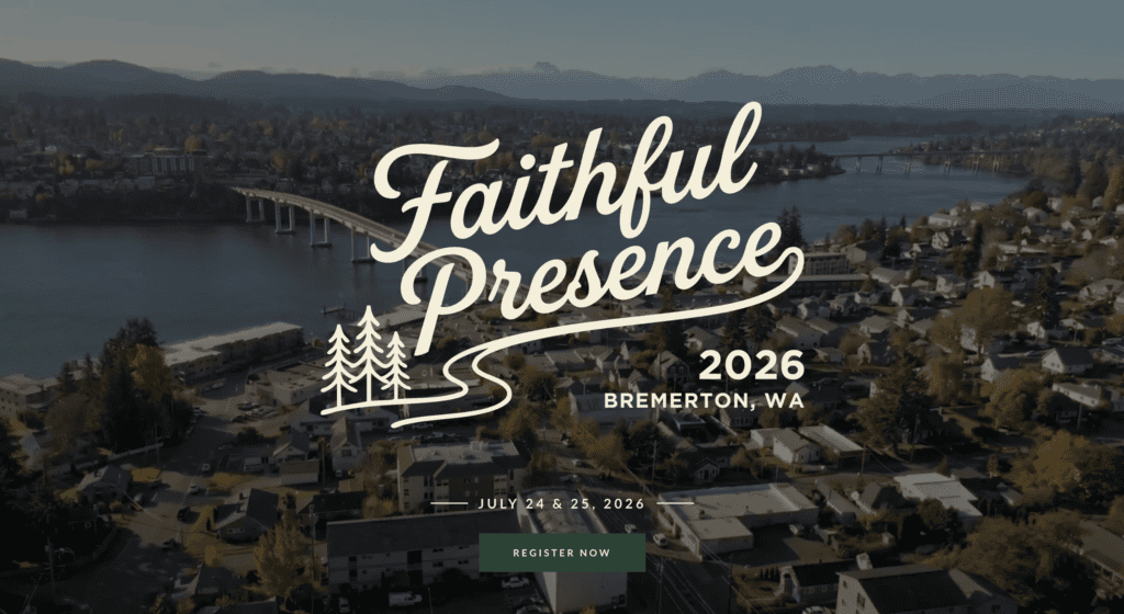
Hero Section
The opening section introduced the conference, location, date, and registration path in one focused first impression.
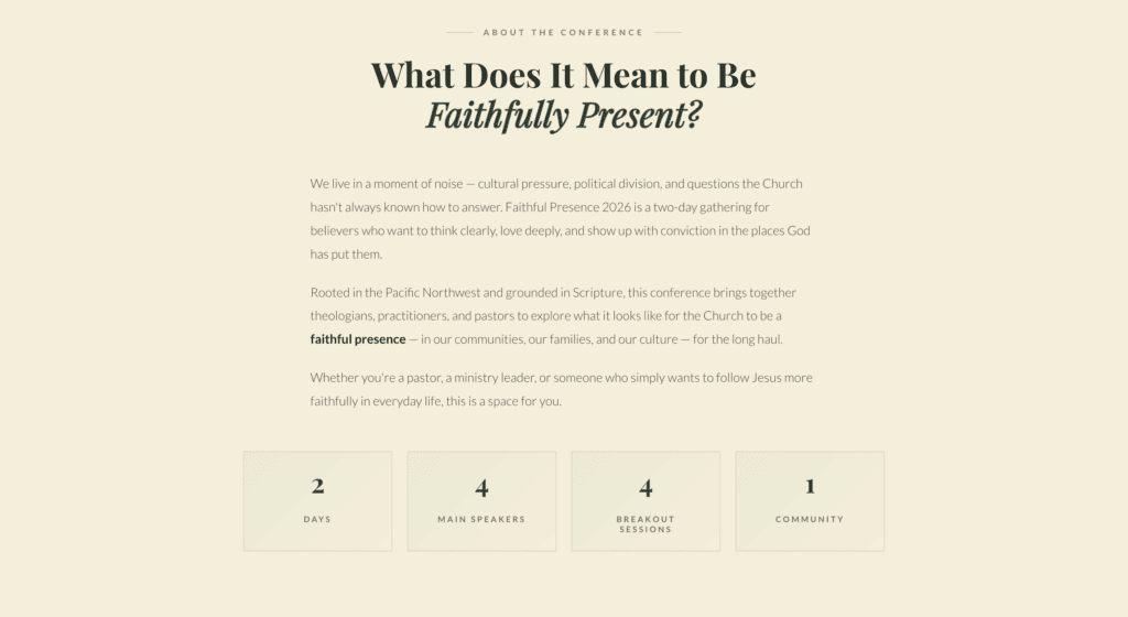
Conference Description
The description section helped visitors understand the heart of the conference before moving deeper into the page.
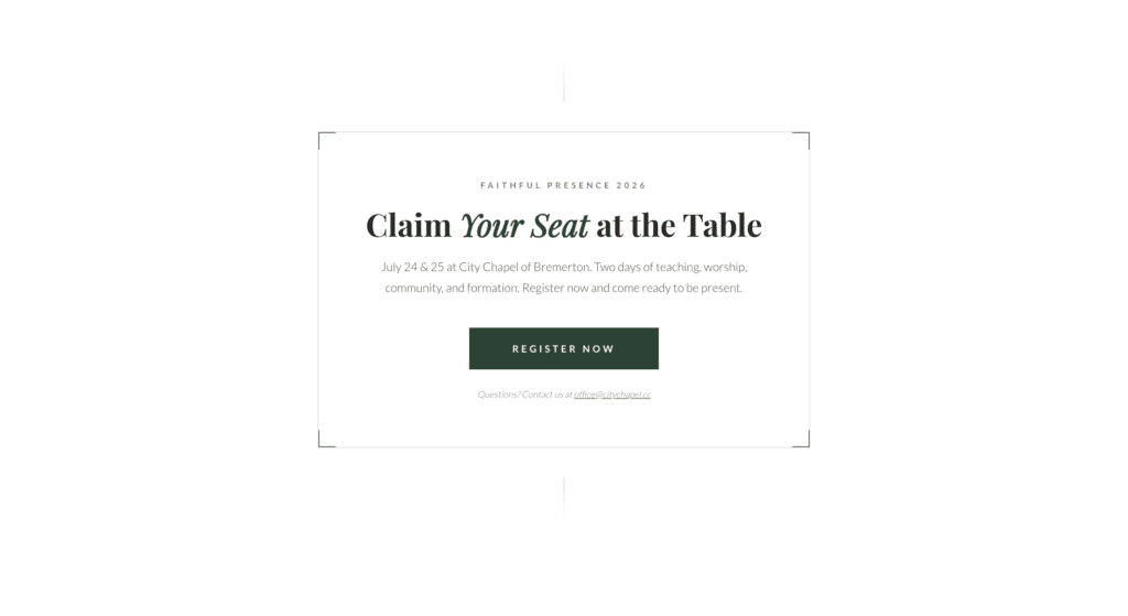
Registration CTA
The CTA section gave visitors an easy place to continue after they had reviewed the event details.
Need your idea to feel clearer online?
When you are ready, compare the plans and choose the level of support that can help your message become easier to share.